The color of our brand, deep purple, is the color of royalty. We always want our clients to feel like they are treated exceptionally well, like royalty. Our logo, although it is reminiscent of a heart, wasn’t our initial intent … the lower case “m” that has a swivel over it represents that we have you covered - when you choose to work with us, you will be cared for. And, lastly, our tagline: “A head for real estate, a heart for people,” is genuinely who we are at the core. We love the business of real estate and we enjoy learning the nuances of the contracts and the legalities of the real estate industry to better protect and keep our clients best interest at heart. We also enjoy learning, growing and mastering our craft.
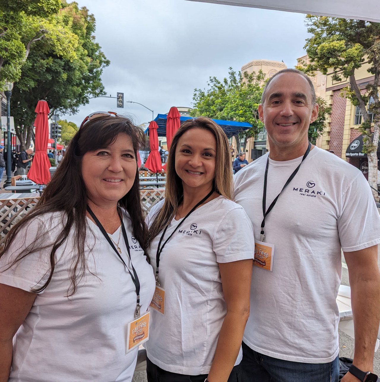
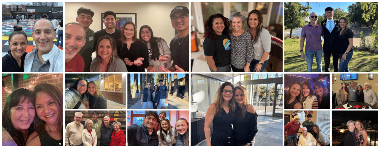
Above all of that, we love people and the way we conduct business is a reflection of that. We would rather spend our marketing dollars supporting local small businesses and volunteering in the community than spending it on buying leads. Our relationship with our clients transcends the transaction. For those who allow us to be part of their lives beyond the close of escrow (which, thankfully, are many), we become friends. We’re beyond grateful that many of our clients choose to share their lives with us.
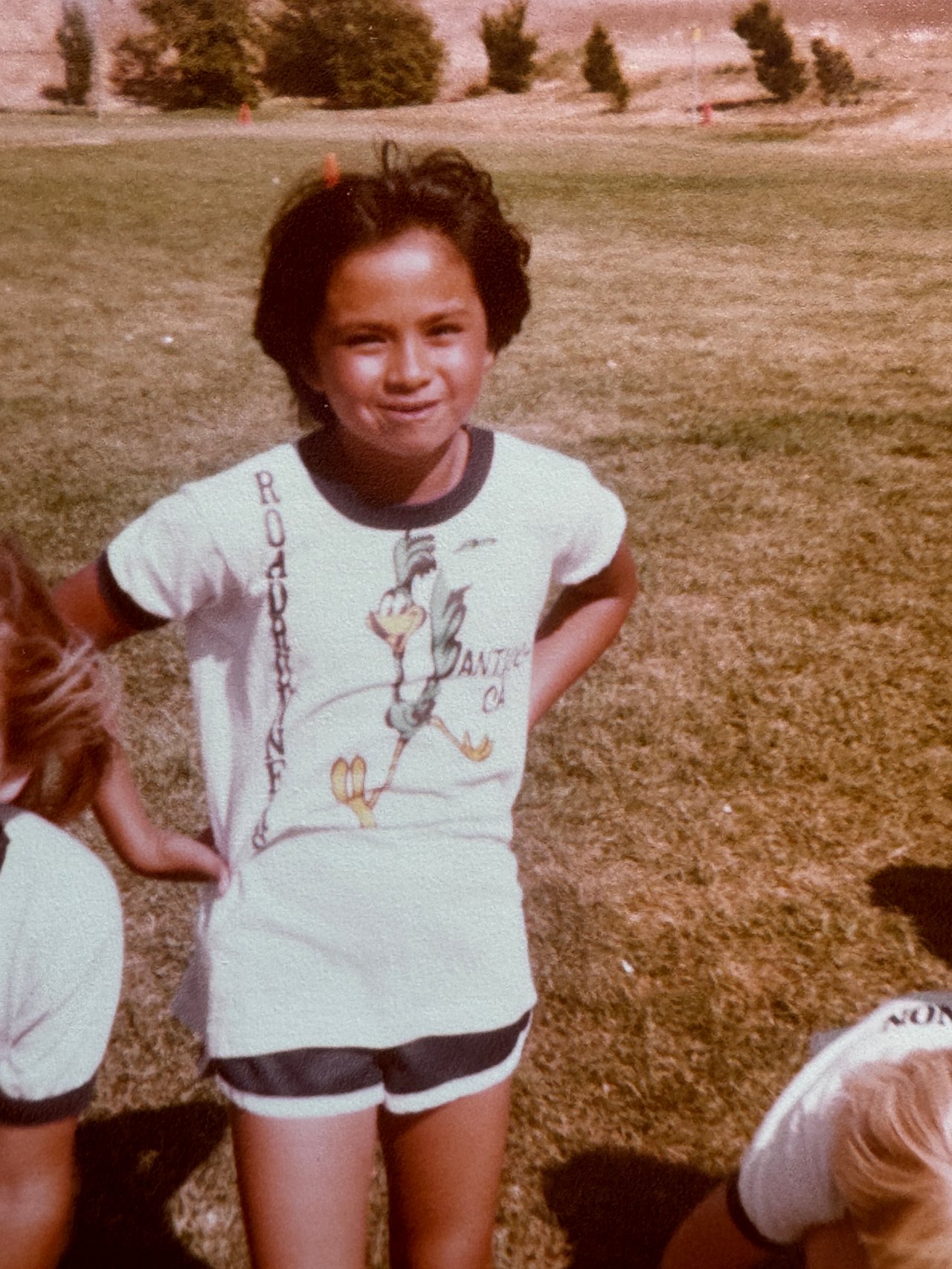
So what have I learned? That the act of surrendering often means that things don’t turn out how we’d planned yet, they turn out better than we expected. Instead of looking at the negatives in life, may we all enter into each situation with excited curiosity, anticipating the best outcome. Instead of expecting the worst to happen, may we have a childlike faith of letting go and asking ourselves, I wonder how this is going to turn out?